 Marianne

Did you know that smartphones accounted for 74% of retail website traffic and 63% of orders in the U.S. in 2020, surpassing desktop use?
Projections suggest that by the year 2027, approximately one-fourth of the overall worldwide retail sales will be attributed to the online sector.
As more consumers turn to online shopping for their food and beverage needs, small e-commerce businesses like yours must prioritize having a mobile-friendly food e-commerce.
To create an optimized mobile site you must consider website responsiveness, mobile optimization for speed, and adaptive design.
This means ensuring that the website of your home-based business is easy to navigate, loads quickly, and provides a seamless experience for mobile shoppers.
The Importance of Mobile Optimization
When it comes to mobile shopping, convenience and speed are paramount. Simply scaling down a desktop website is insufficient.
If you want to create an optimized mobile site, factors such as website responsiveness, mobile optimization for speed, and adaptive design must be considered.
Why is crucial to Optimize the mobile Experience for Your Home-based Food eCommerce?
In 2016, Google introduced mobile-first indexing, a practice where search engines primarily use the mobile version of a website’s content for indexing and ranking. This adaptation aimed to align with the evolving habits of internet users.
It’s important to know that users have high expectations, even beyond typical desktop standards:
- If a website takes 10 seconds to load instead of 1, there’s a 123% increase in the likelihood of visitors clicking away.
- If a website takes more than four seconds to load, one in four users leave the website.
People conduct research while commuting, during breaks, and even while watching TV, as you do probably too.
Consequently, it becomes evident that your home-based food business needs a website that is clear, fast, and responsive for mobile users.
Last but not least, people use their phones to look for directions, coffee shops, and restaurants/shops near them. We use our smartphones for local research, but rarely our laptops as we don’t go for a walk in the city with them…
Building an Efficient and Optimized Site for Mobile Devices for your small e-commerce business
The importance of a responsive website:
A responsive website is designed to adapt to the user’s behaviour and environment, based on the screen size, platform, and orientation of the device being used. No need for additional work for your mobile-friendly food e-commerce as it readjusts itself.
User Experience/UX Design:
For most users, a responsive website is not enough, your website needs to be easy to navigate, and not cluttered.
Avoid using pop-ups as they can be hard to close, or do tests before making your final choice.
1/ Make sure that the clickable area is big enough for fingertips.
2/ Make sure that the distance between different clicks is not too close or too small.
3/ Make sure that your mobile menu is easy to navigate. The hamburger menu is widely used and recognized by mobile users, making it a popular choice for your small e-commerce business.
4/ Make sure to use a font that is easy to read.
5/ If you use forms make sure that they fit well on smartphone screens.
6/ Make sure to choose the right keyboard for the users, this way it will be easy for them to fill in any information they need.
5 tips to optimize the page load:
1/ Resize and compress images: Images must be appropriately scaled down to make content readable on small screens. Additionally, compressing and optimizing images can significantly improve page load speed.
2/ Choose the Correct File Format: Select the appropriate file format for images. For example, JPEG works well for photograph-like images, while PNGs are suitable for logos and textual banners. WebP is a new format that offers the best image compression.
3/ Reduce Page Weight: A lighter page will load quicker on mobile devices. This can be achieved by minimizing the size of videos, images, scripts, styles, and fonts.
4/ Enable Browser Caching: Browser caching allows the browser to store various information, such as stylesheets, images, and JavaScript files, so it doesn’t have to reload the entire page every time a user visits it, thereby improving loading speed.
5/ Assess Mobile Site Speed: Use tools like Test My Site to assess the website’s mobile performance and identify improvement areas.
By implementing these tips, your mobile-friendly food e-commerce website can significantly improve the page load speed, providing a better user experience and potentially boosting conversion rates.
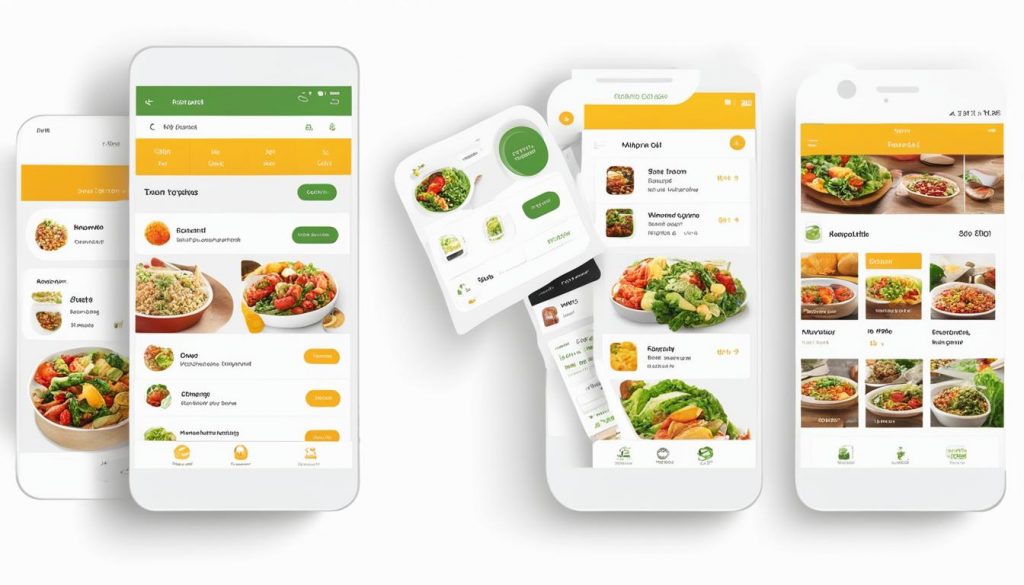
Designing a Mobile-Friendly Menu for Your home-based food business
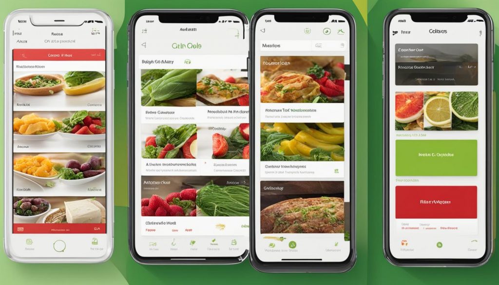
In the realm of food eCommerce, creating a mobile-friendly menu is essential for a smooth customer experience.
1/ Prioritize and Organize Pages:
Ensure that menu pages are organized by priority from top to bottom. This helps customers quickly find what they’re looking for without unnecessary scrolling.
Example: If your home-based business offers muffins, bagels, and croissants, prioritize them based on popularity. Bagels might come first, followed by muffins and croissants.
2/ Intuitive Navigation:
Design an intuitive and easy-to-navigate menu. Group similar items together, and use clear labels to avoid confusion.
Example: Have a section labelled “Jams & Jellies”, and “chutneys” with subcategories like “Sugar-free” for easy navigation.
3/ Visual Appeal:
Optimize images for mobile viewing, ensuring they are clear and load quickly. Use high-quality visuals to entice customers.
Example: Include delicious images of your best-selling baked goods, jams or condiments…. A clear image of a mouth-watering cake can prompt a quicker order.
4/ Streamlined Ordering Process:
Make the ordering process seamless. Reduce unnecessary clicks and steps, allowing customers to place orders with minimal effort.
Example: Implement a straightforward “Add to Cart” button and a visible “Checkout” option for a hassle-free ordering experience.
5/ User-Friendly Language:
Use simple and clear language in menu descriptions. Avoid jargon and provide concise details to assist customers in making informed choices.
By incorporating these mobile-friendly menu design tips, your mobile-friendly food e-commerce can enhance user satisfaction and drive more successful transactions.
Key Takeaways:
- Mobile devices are now the primary device for online shopping in the food industry.
- Google’s mobile-first indexing emphasizes the need for businesses to prioritize mobile optimization for better search engine visibility.
- Slow-loading websites can result in a high bounce rate.
- User experience (UX) design plays a crucial role in ensuring easy navigation, readability, and efficient interaction on mobile devices.
- Implementing responsive web design, efficient page loading strategies and a user-friendly mobile menu are essential for a successful mobile-friendly food e-commerce site.
- Prioritizing and organizing menu pages, intuitive navigation, visual appeal, streamlined ordering processes, and user-friendly language are key elements for designing a mobile-friendly menu.
Greg Gifford, SEO guru:
‘’Flip the direction in your head. When you’re designing content for your site, you should be designing the content for how it looks on mobile screens. You need to truly think mobile first’’
But do not worry at FreshFind, we stand out as a beacon for artisans with our seamlessly mobile-friendly platform. Setting up your storefront takes a mere 2 minutes, and the entire eCommerce solution is designed for easy navigation on smartphones and tablets.
Check us out today and excel your business to the next level.


GIPHY App Key not set. Please check settings